
Unifying sales, inventory, and customer insights for ramen restaurants.
Nearly 30% Of Food Produced Globally Is Wasted, Often Due To Poor Inventory Tracking And Forecasting.
(FAO, 2023)
Summary
Al Dente is a tablet-first, all-in-one inventory and operations management SaaS designed for ramen restaurants struggling with fragmented tools and manual spreadsheets.
Team
4 UX Designers (Farwa Babar, Emily Corkery, Sang Jyun Yoon, and Mike Li)
My Role
UX Designer ~ Responsible for overall insights and ingredient management experience
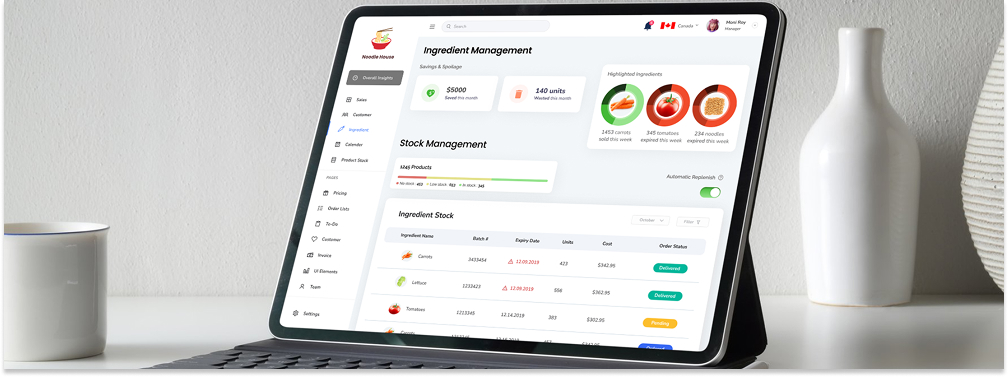
Mockup of the Al Dente dashboard interface ingredient management page.
Impact
Simplifying complex restaurant operations.
Actionable Insights Through One Unified Dashboard.
sales, inventory, customers, and forecasting
overall insights & ingredient management
replacing manual spreadsheets and fragmented tools
Secondary Research
Understanding Real Operational Pain Points In Restaurant Management
Research Foundation
We conducted secondary research to understand how restaurant managers currently track income, expenses, inventory, and customer data revealing heavy reliance on disconnected tools and spreadsheets. This confirmed a strong need for a centralized system that reduces manual consolidation and human error.
.png)
Some of the secondary sources we used for research.
Personas
Designing For Real Managers, Not Assumptions
Defining The Problem
We created personas representing ramen restaurant managers balancing daily operations, inventory control, and customer satisfaction. These personas grounded our design decisions in real constraints like time pressure, cost sensitivity, and the need for fast insights.
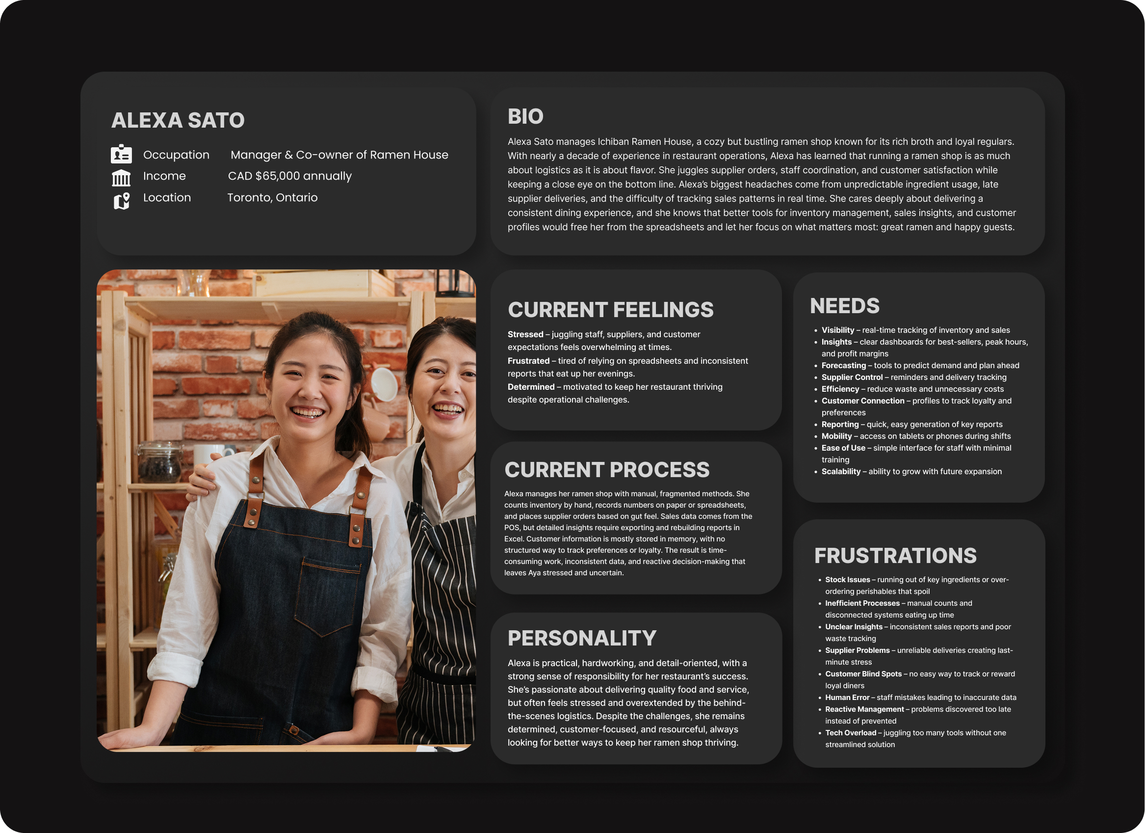
One of the restaurant manager personas.
User Journey
Identifying Friction Across Daily Workflows
Major Friction Revealed
Journey mapping revealed major friction when managers switched between tools to track sales, inventory, and budgets. These gaps directly informed our decision to unify insights, forecasting, and alerts into one continuous experience.
.jpg)
User Journey Stages (Click to Zoom).
Crazy 8s + Solution Sketches
Exploring Breadth Before Narrowing Solutions
Rapid ideation allowed us to explore multiple dashboard layouts, data visualizations, and automation concepts. This helped us converge on a solution that balanced powerful data with clarity without overwhelming users.
Crazy 8S
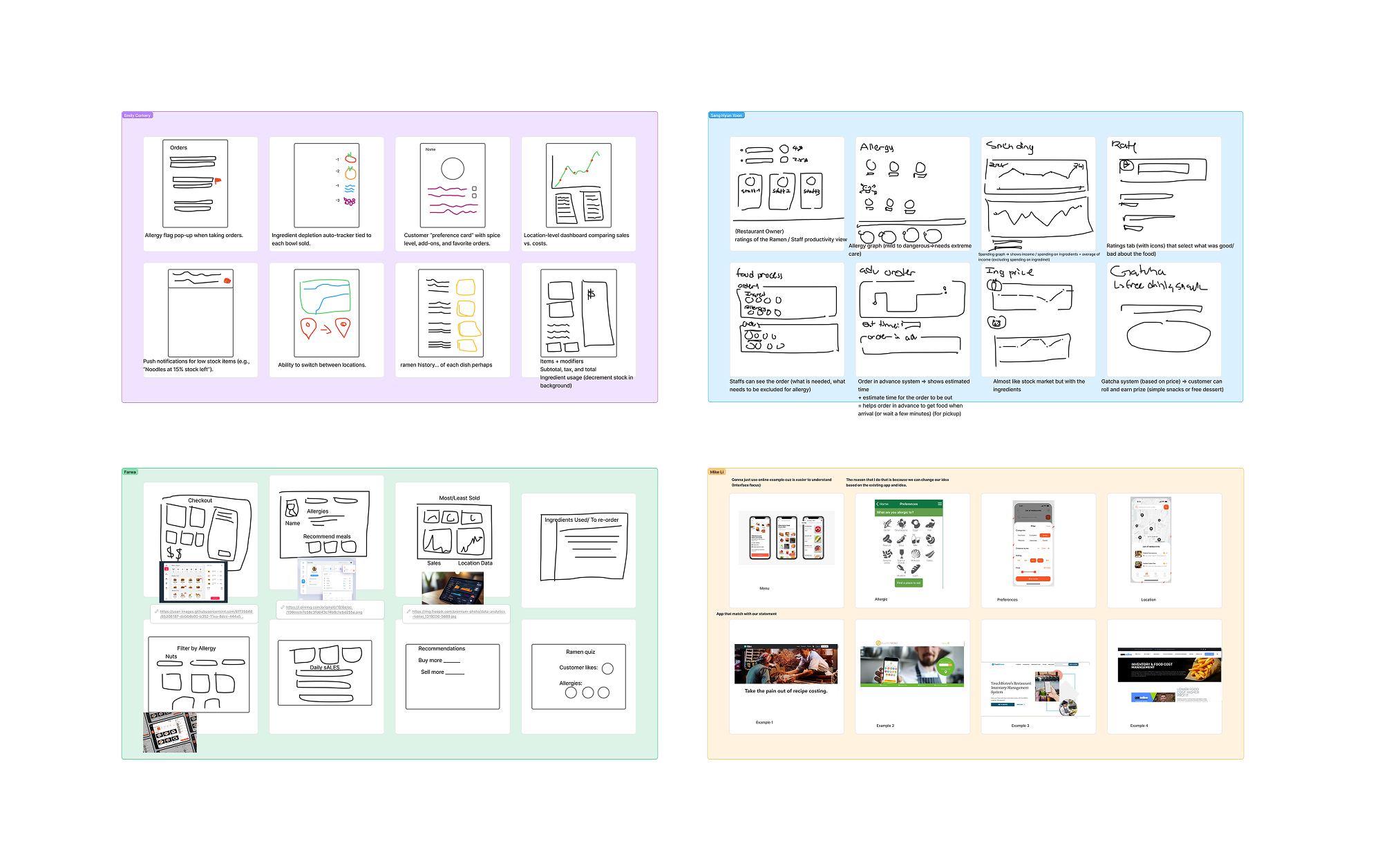
Crazy 8s activity to explore multiple dashboard layouts and concepts.
Solution Sketches
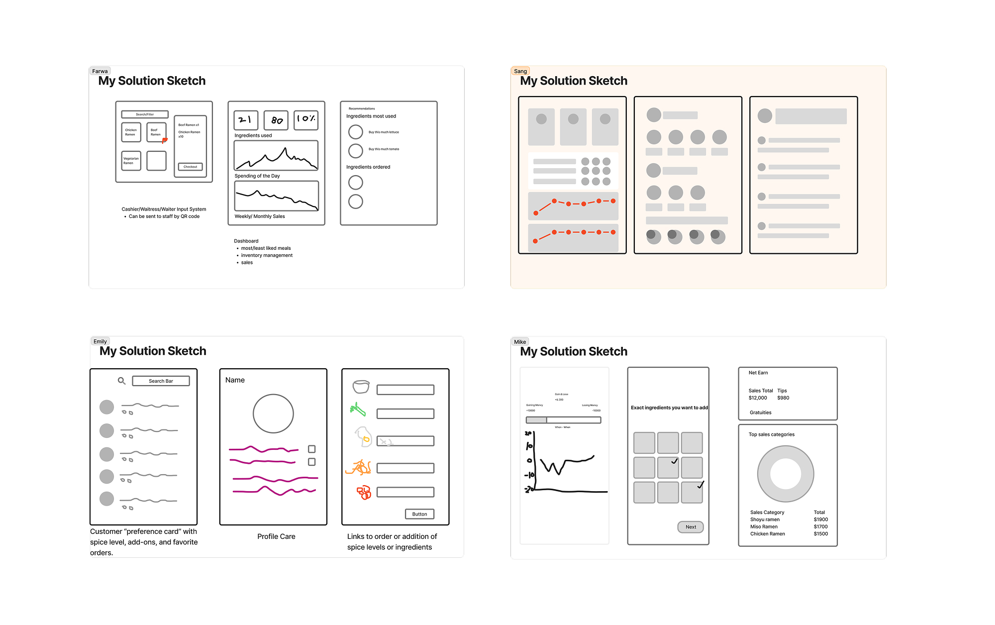
Solution sketches to refine and communicate our final dashboard design.
Competitive Analysis
Odoo
MarginEdge
Sage
7Shifts
Odoo
Strengths
All-In-One Platform
Odoo offers all features in one software to track packing, storage management, and more.
Weaknesses
Complexity
Information overload with a steep learning curve and no customer analytics.
Low-Fidelity User Testing
Catching Usability Issues Before Visual Polish
We conducted usability testing on the low-fidelity prototype to evaluate whether restaurant managers could quickly understand sales insights, inventory status, and budgeting information.
Before: Overall Insights
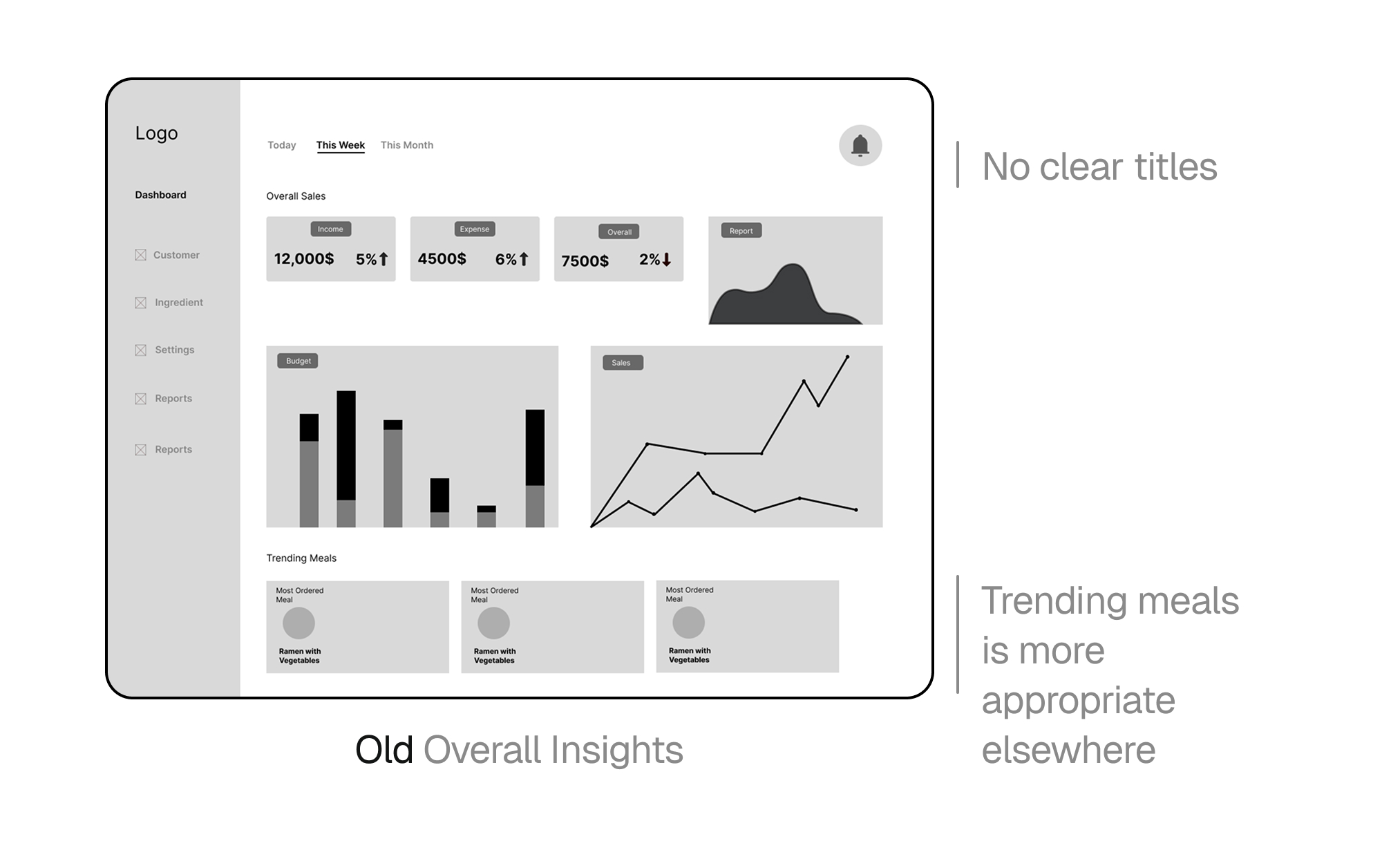
Screenshot of the overall insights page before refinements after user testing including clear titles and removing tranding meals.
After: Overall Insights
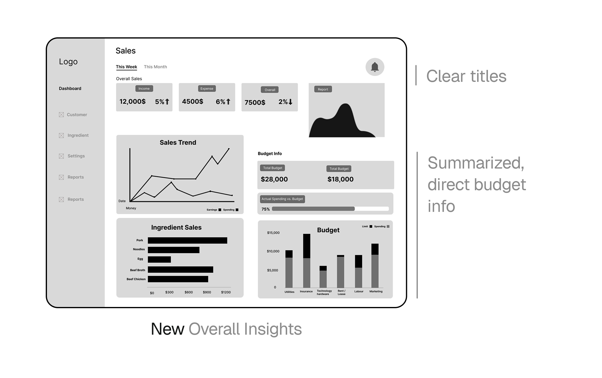
Screenshot of the overall insights page after refinements with clear titles and succinct budget information.
Before: Ingredient Management
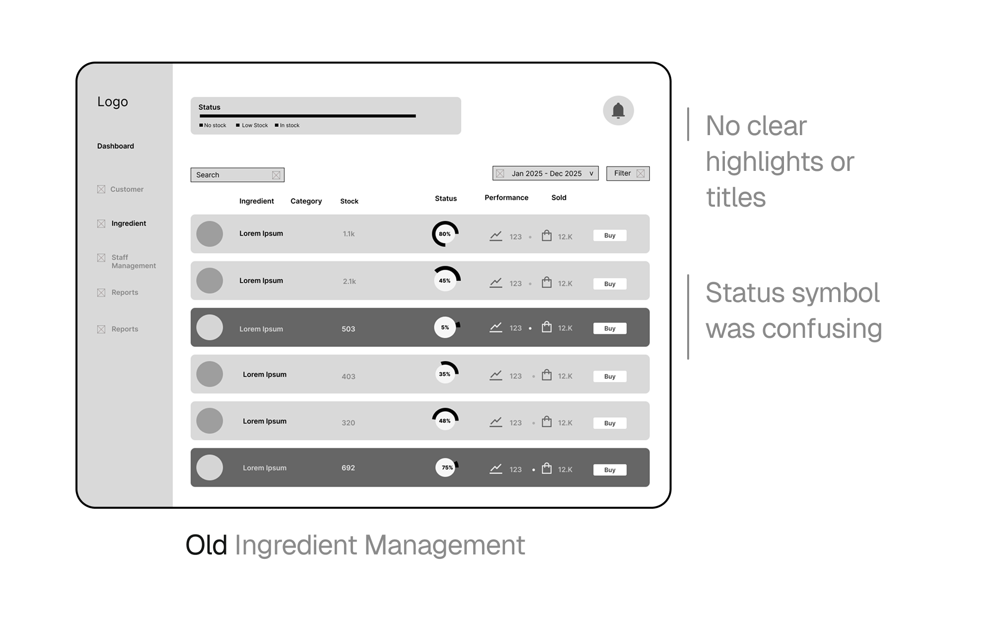
Screenshot of the ingredient management page before refinements after user testing including titles, highlight section, and renewed ingredient table.
After: Ingredient Management
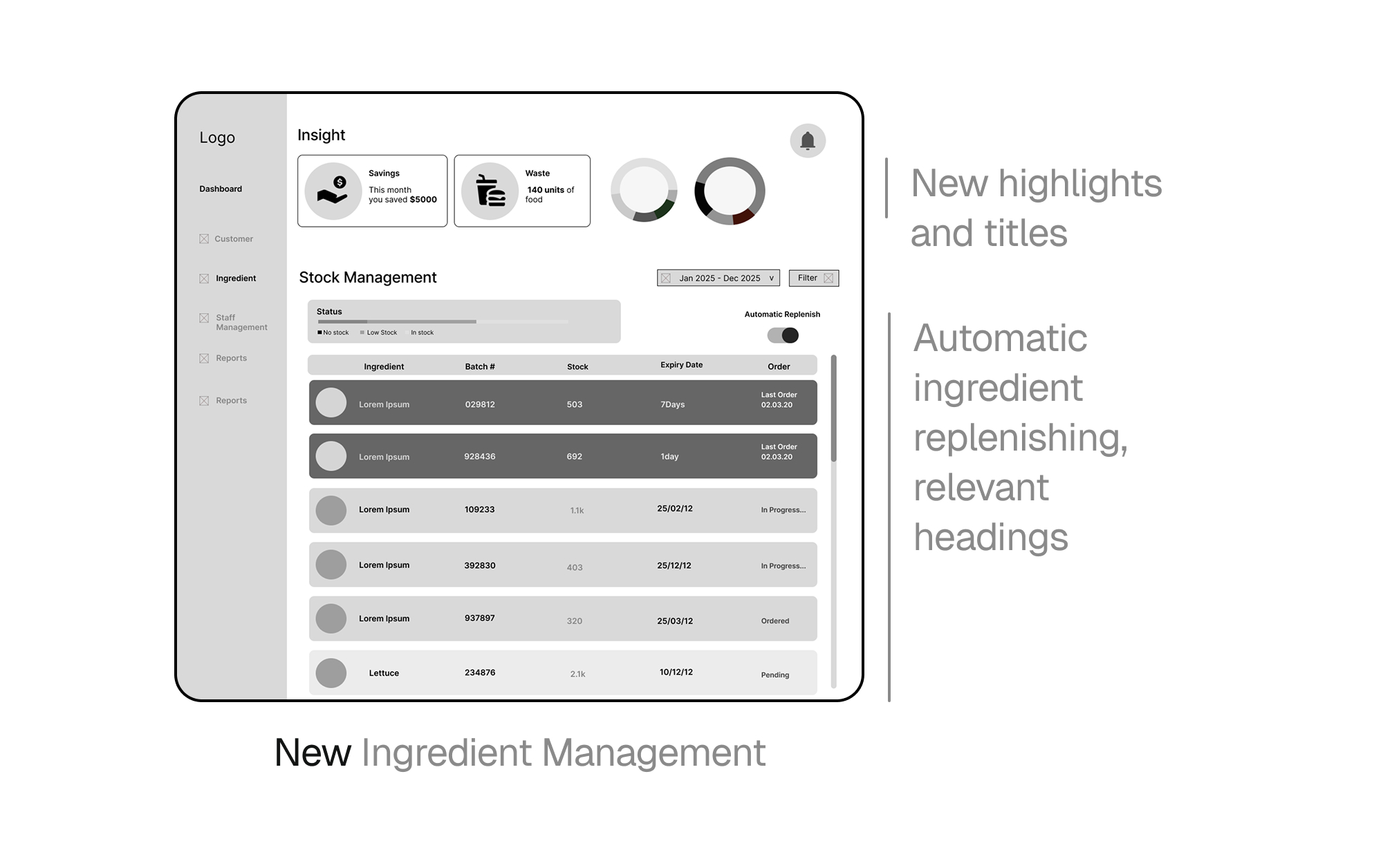
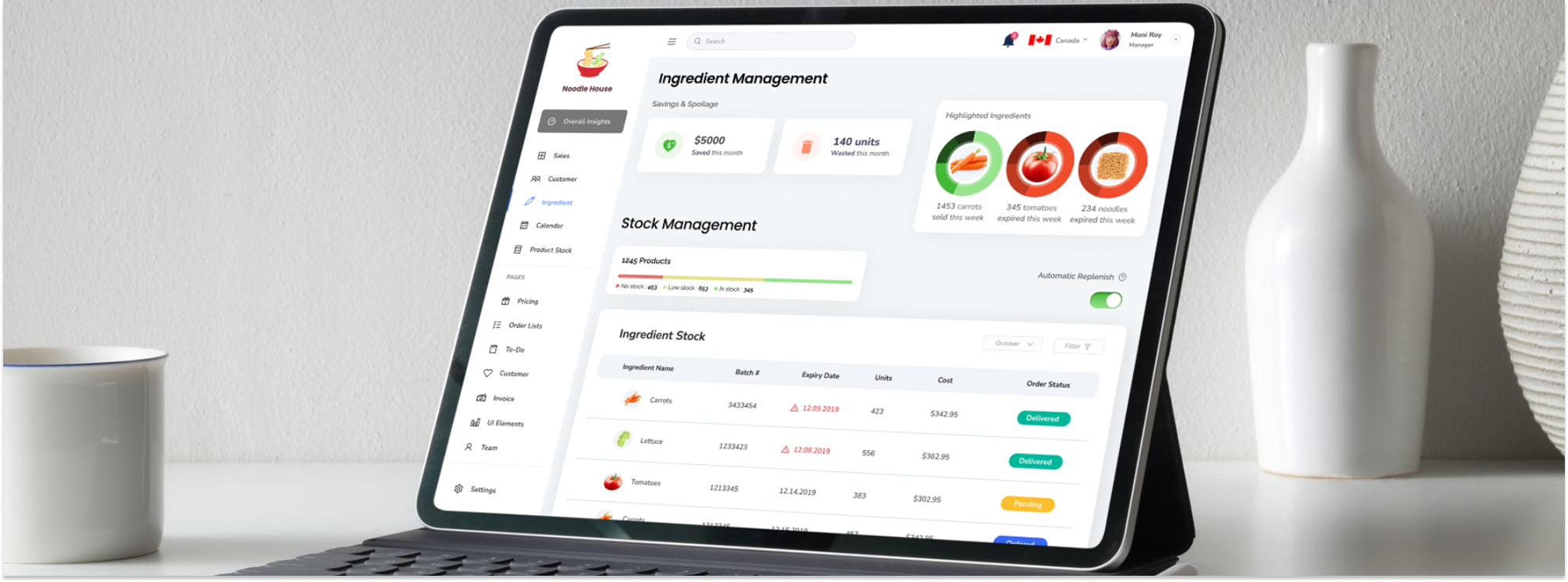
Screenshot of the ingredient management page after refinements with clear titles and highlighted information and improved ingredient table.
The Final Product
Turning Complex Data Into Clear Decisions
System-Driven UX Design
Al Dente brings together sales trends, budget tracking, customer analytics, inventory forecasting, expiry alerts, and auto-replenishment in one cohesive experience. Familiar spreadsheet-style comparisons paired with visual charts help managers confidently share insights with investors, accountants, and advisors.
Demonstration of the overall insights page to ingredient management page.
Ingredient Management + Overall Insights
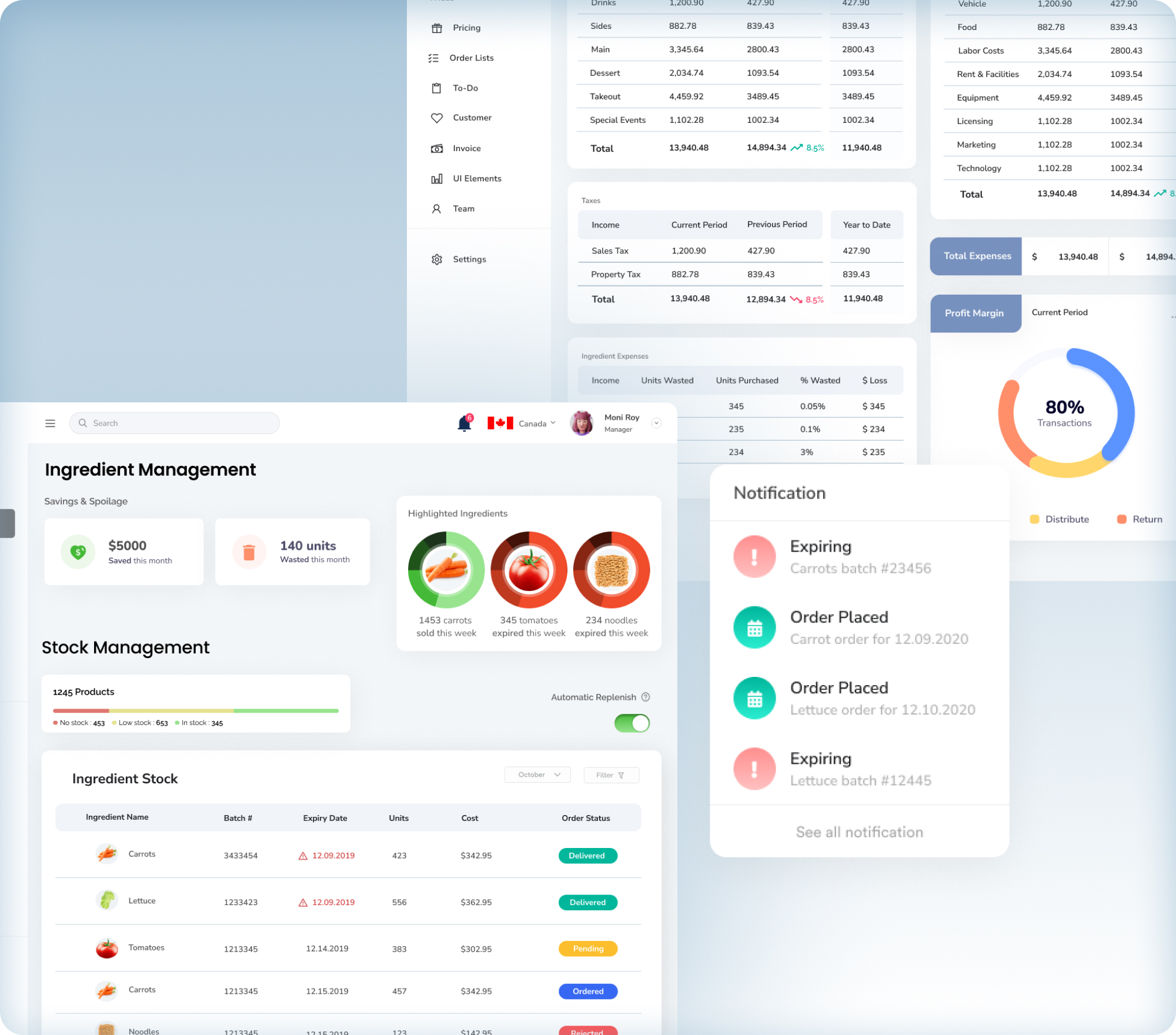
Screenshot of the ingredient management and overall insights pages.
Sales Dashboard + Customer Analytics
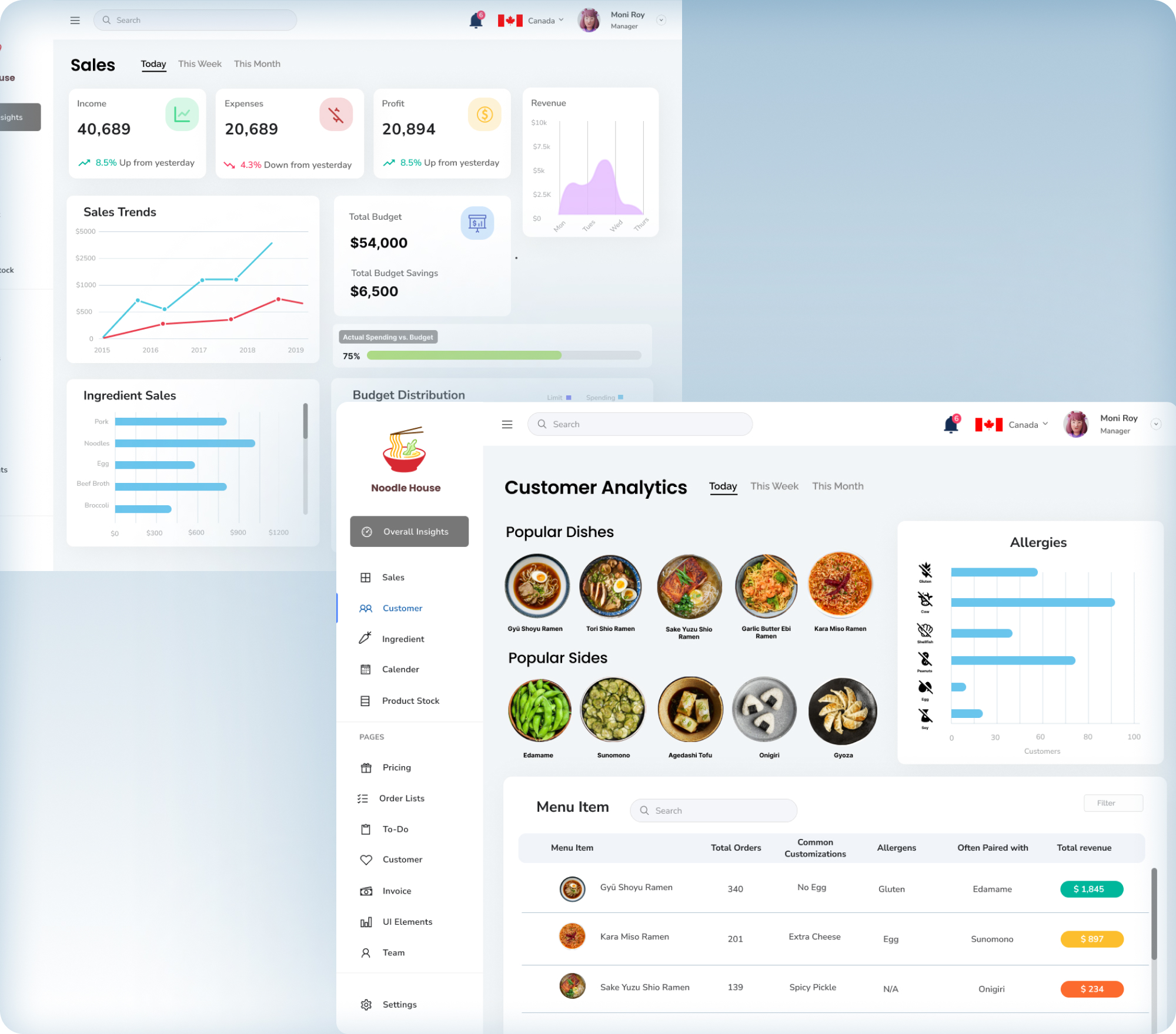
Screenshot of the sales dashboard and customer analytics pages.
Impact
Simplifying complex restaurant operations.
Actionable Insights Through One Unified Dashboard.
sales, inventory, customers, and forecasting
overall insights & ingredient management
replacing manual spreadsheets and fragmented tools
Reflection
Designing For Clarity At Scale
Key Takeaways
This project reinforced that designing data-heavy products is less about adding features and more about reducing cognitive load through clarity, hierarchy, and familiarity. User testing on our low-fidelity prototype revealed how quickly complexity can overwhelm users, guiding us to lean into spreadsheet-inspired layouts, clearer comparisons, and more actionable alerts. Collaborating within a team of UX designers strengthened my ability to communicate design rationale, iterate quickly, and refine solutions based on real user feedback.