A collaborative website redesign with UX improvements to elevate Prookie’s presence.
Research Shows That 75% Of Users Judge A Brand’s Credibility Based On Its Website Design.
(Fogg, 2002)
Summary
I worked with two UX/UI designers and Prookie’s founder to redesign Prookie’s website using Figma and Wix. The project focused on improving visual clarity, usability, and product presentation while respecting the founder’s existing brand vision.
Team
3 UX/UI Designers (Farwa Babar,Elaine Chen, Faria Islam), 1 Founder (Cogie Cogan)
My Role
UX/UI Designer ~ In charge of landing page, checkout flow and instagram showcase section.
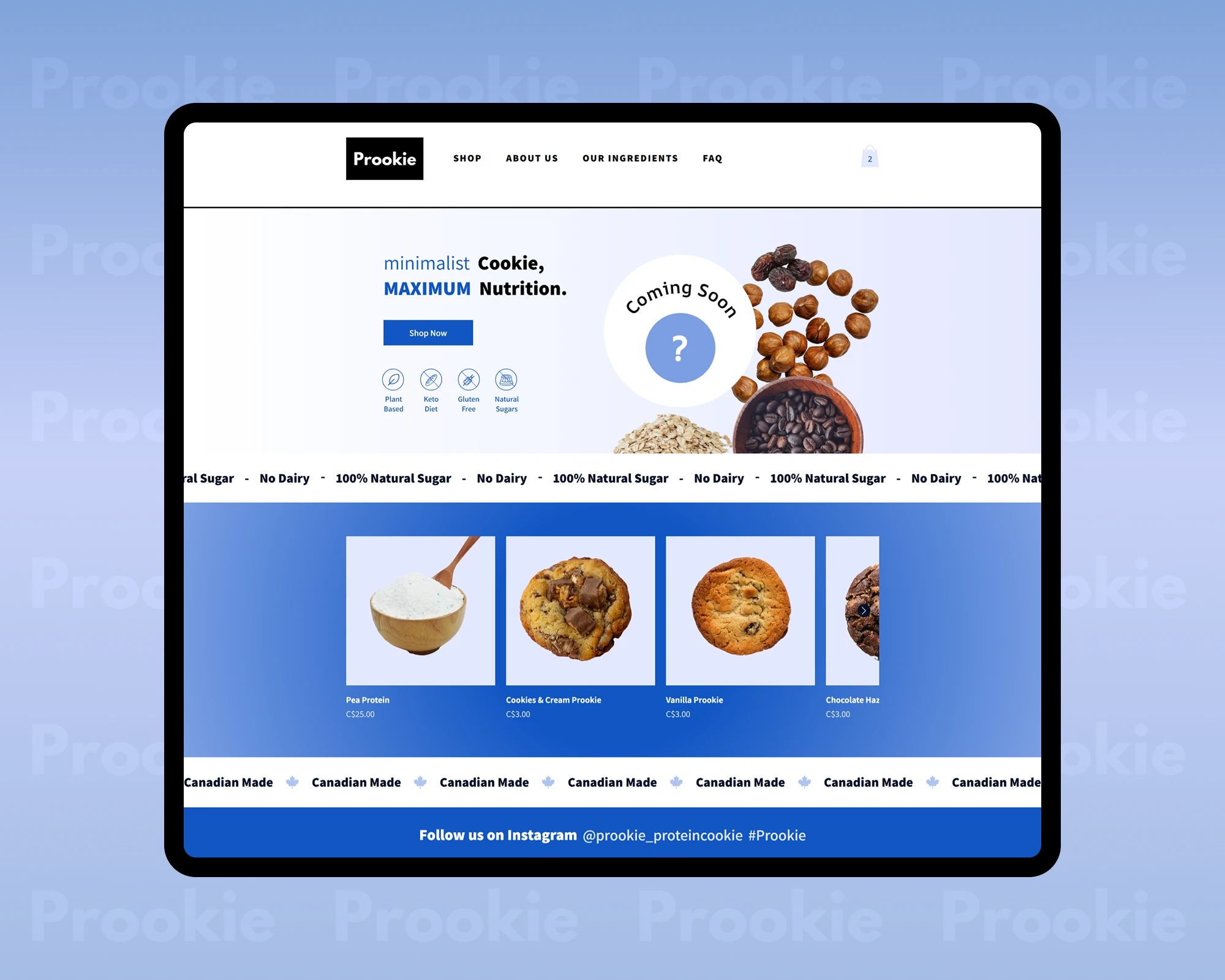
Mockup of the Prookie landing page.
Launched April 2026 - May 2026
Before/After
Can You Spot The Difference?
Slide The Bar Below To Compare:
Slide to compare before and after: website redesign.
Impact
Strengthening Prookie’s first impression.
A More Polished, Conversion-Ready Experience.
implemented directly in Wix
to refine hierarchy and visual clarity
aligned with founder vision and user needs
Defining Scope
Project Context & My Role
Designing With Real-World Constraints
Prookie is a plant-based, keto-friendly, gluten-free protein cookie brand targeting health-conscious consumers who value clean ingredients and natural sugars. I worked directly in Wix alongside two UX designers, Elaine Chen and Faria Islam, and the founder, Cogie, contributing both hands-on execution and strategic UX decisions with a focus on improving the website’s primary conversion surface: the landing page.
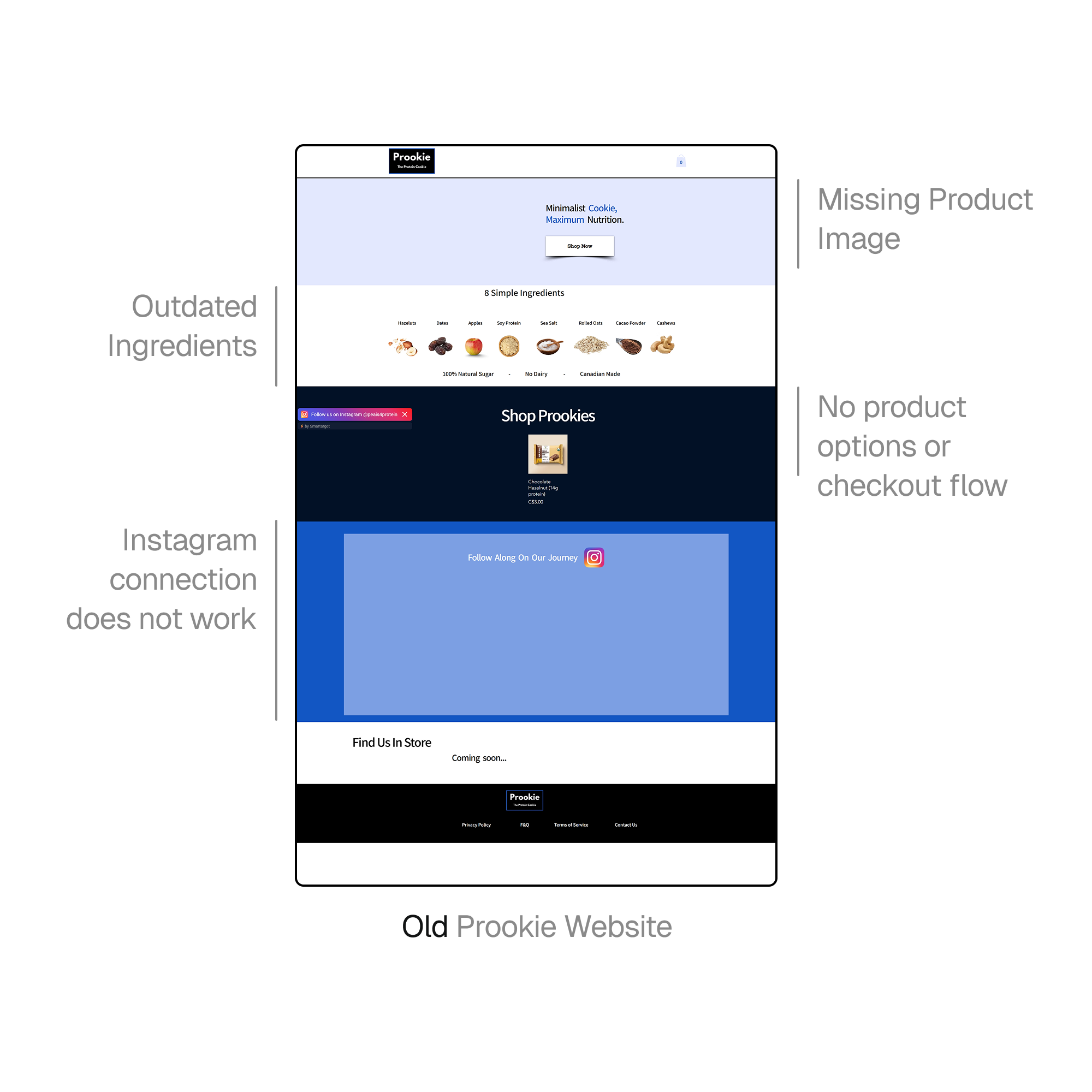
Screenshot of the old Prookie website before redesign.
Initial UX Cleanup
Establishing A Functional, Trustworthy Baseline With Stakeholder Goals
Initial Requests & Functional Improvements
Before proposing visual changes, I focused on delivering the founder’s requested updates to ensure the website functioned smoothly and communicated credibility. These foundational improvements addressed usability gaps and prepared the site for more strategic design enhancements.

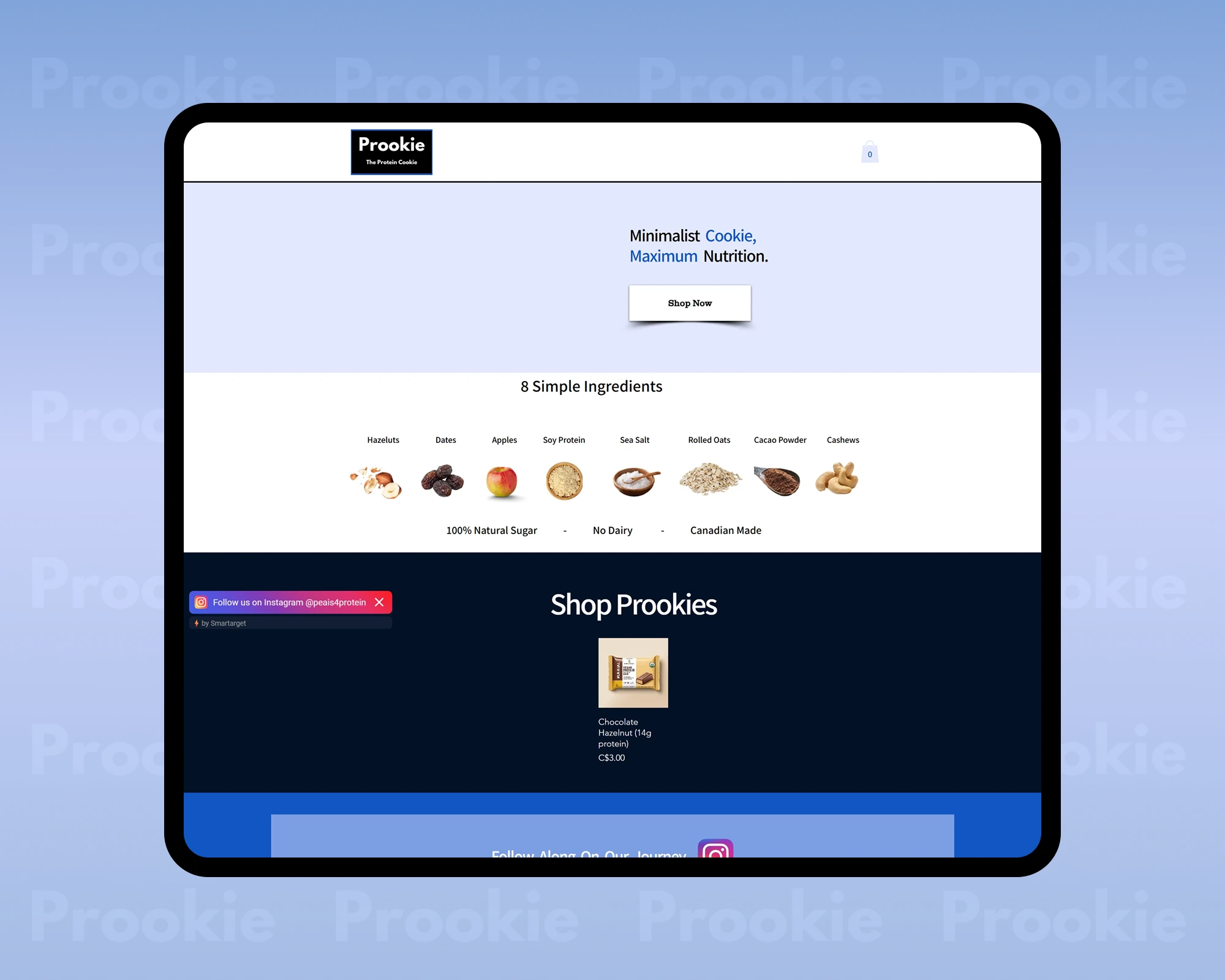
Screenshot of the prookie website with its first set of updates.
What Did I Change?
- Redesigned the ingredient list for clarity and scannability
- Added product image placeholders to the landing page
- Created placeholder product listings
- Improved checkout functionality
Opportunity Identification
Identifying The Core UX Opportunity
Why The Landing Page Needed More Than Surface-Level Fixes
After completing the initial updates, I identified the landing page as the most impactful opportunity to improve first impressions and conversion. Because it is often a user’s first interaction with the brand, even small design decisions could significantly affect trust, clarity, and engagement.

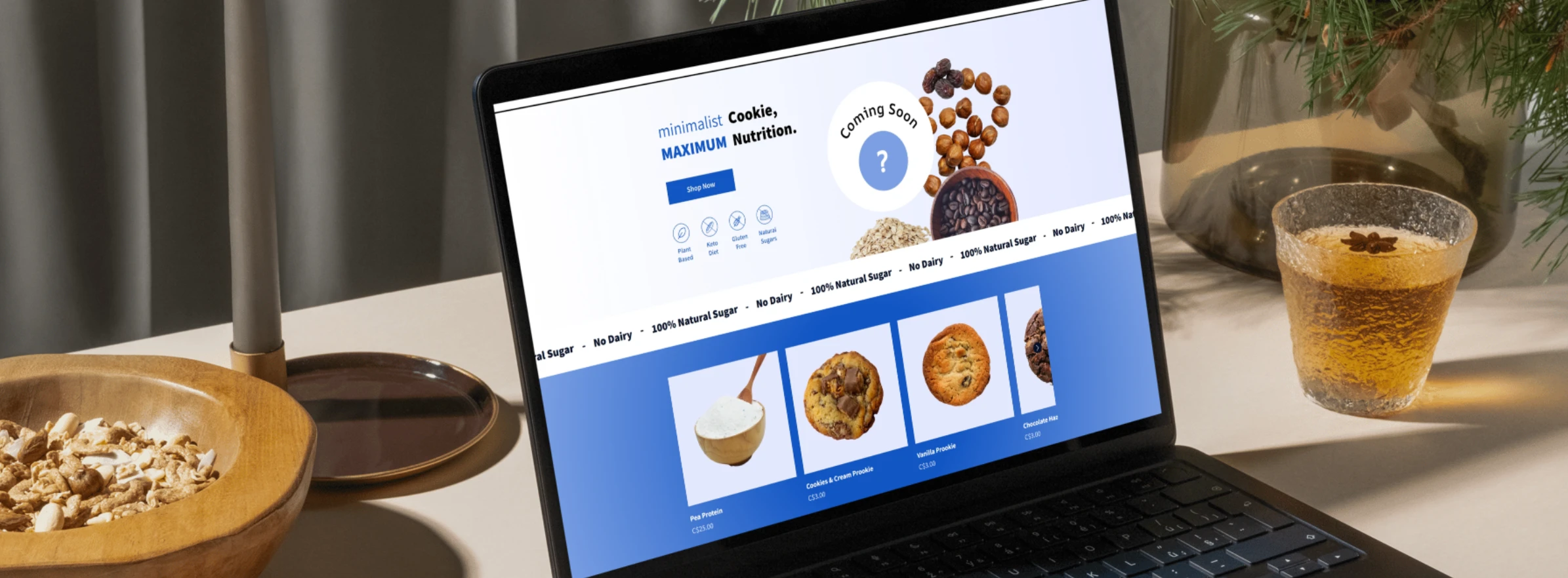
Screenshot of the prookie website after minor changes, but still having room for improvement.
Visual Exploration
Exploring How Protein Brands Build Trust Visually
Visual & Competitive Exploration
To inform potential improvements, I explored competitor protein snack websites and reviewed cookie brand designs on Dribbble to understand common visual patterns and expectations in the health-food space. This research helped guide layout, imagery, and hierarchy decisions while remaining flexible to the CEO’s preferences.
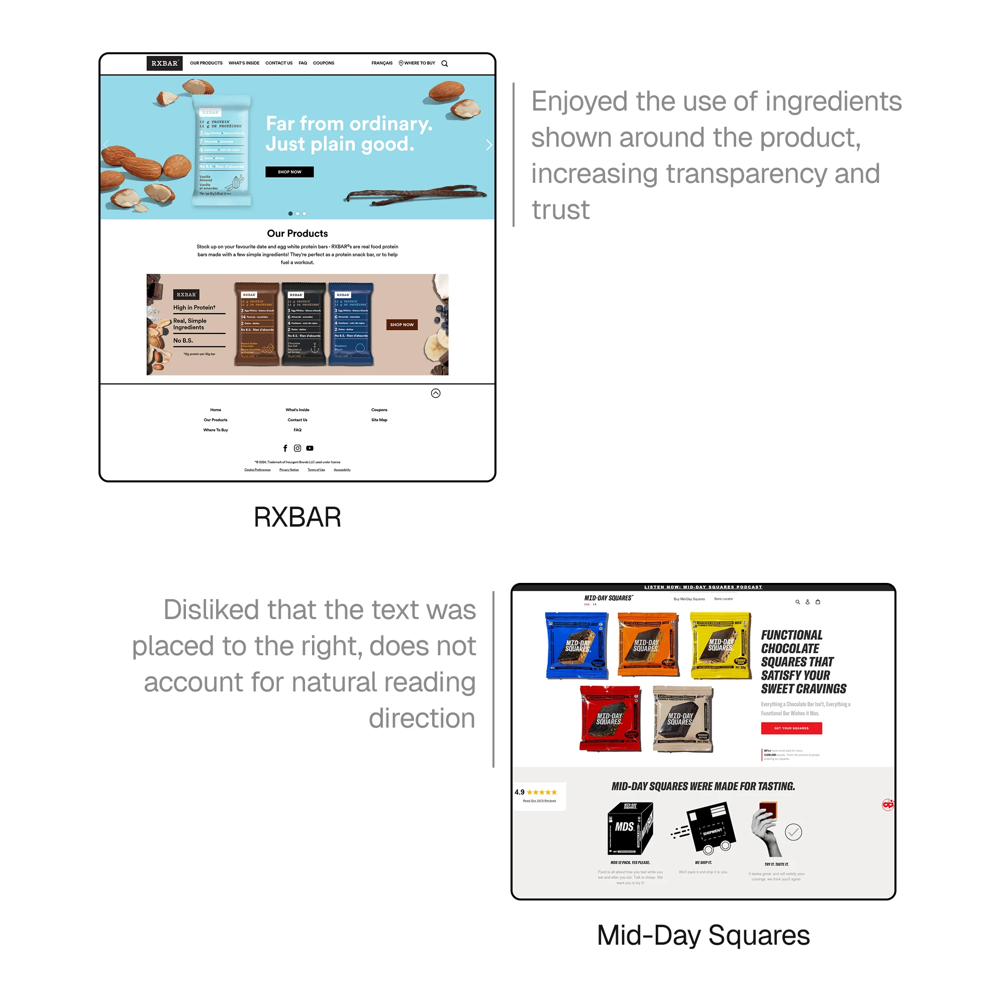
Screenshot of competitor websites annotated with design notes.
Font Exploration

Image overview of different fonts explored.
Color & Logo Exploration

Image overview of different colour schemes explored for the brand.
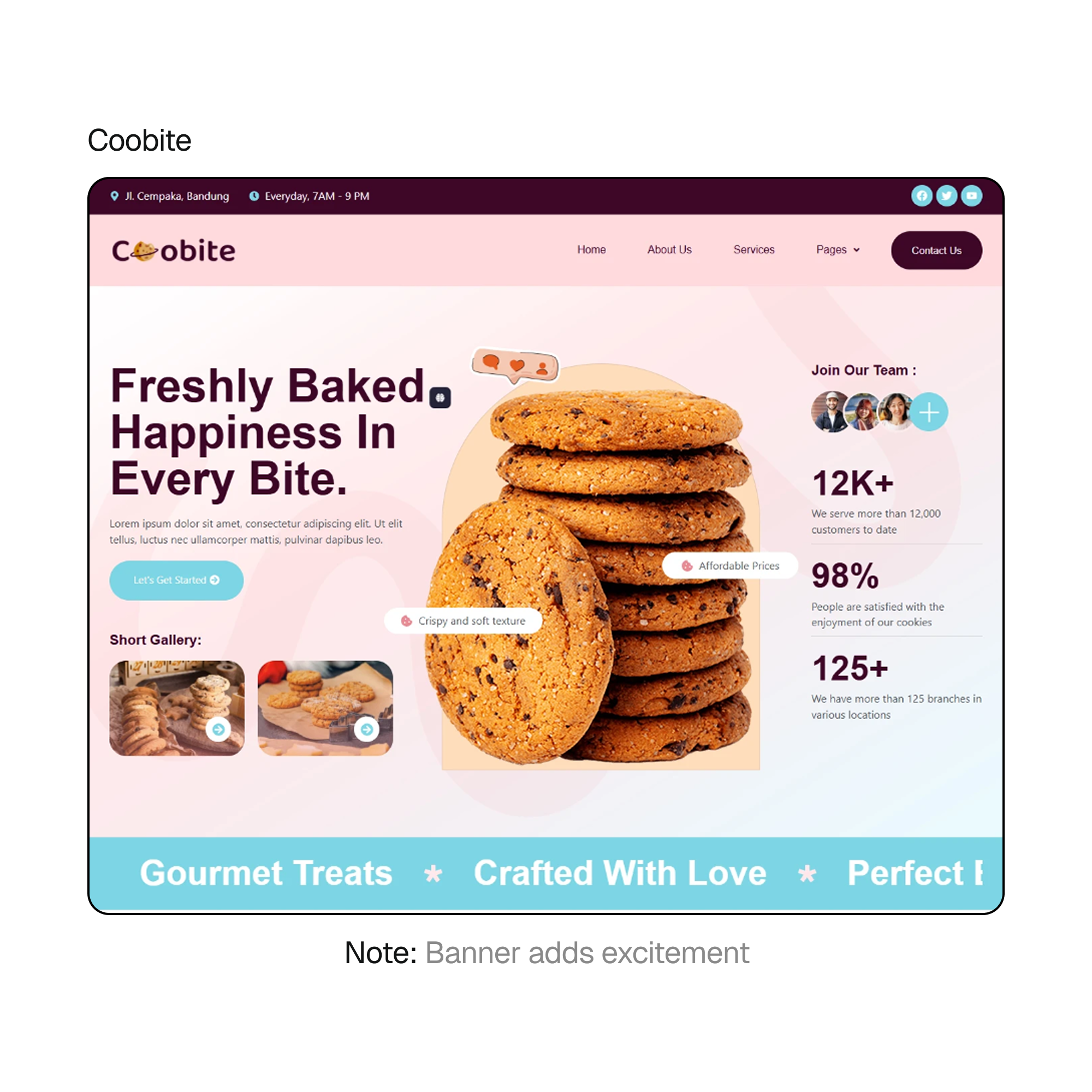
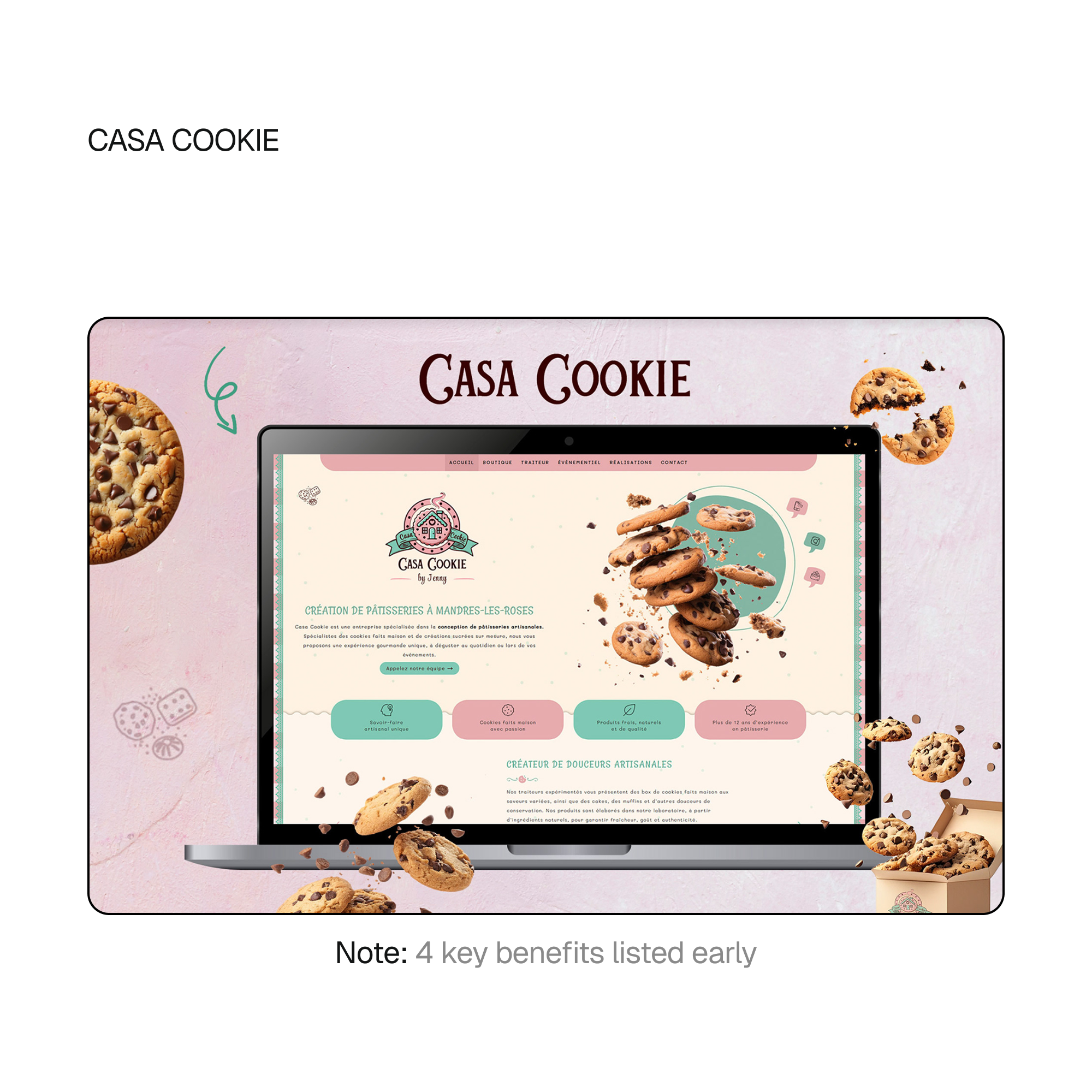
Competitive Gallery
Coobite
CASA COOKIE
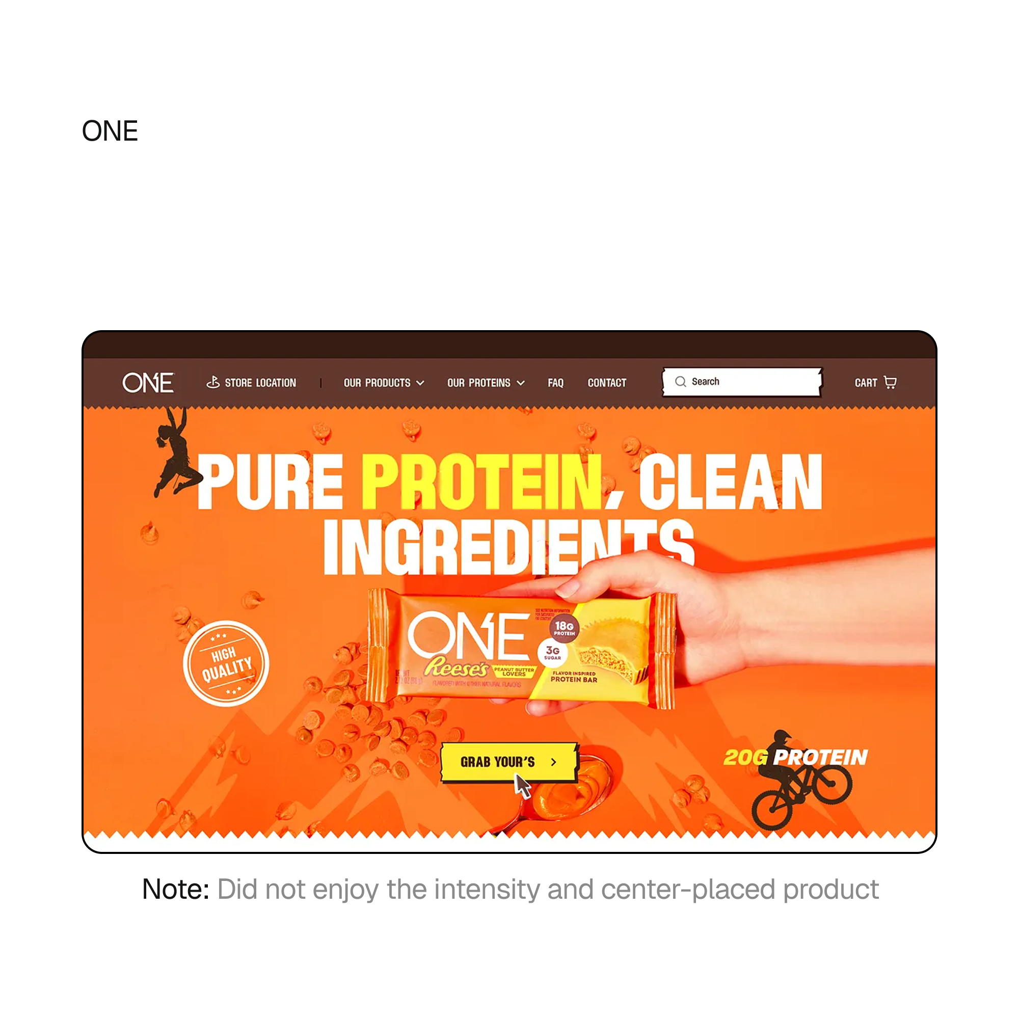
ONE
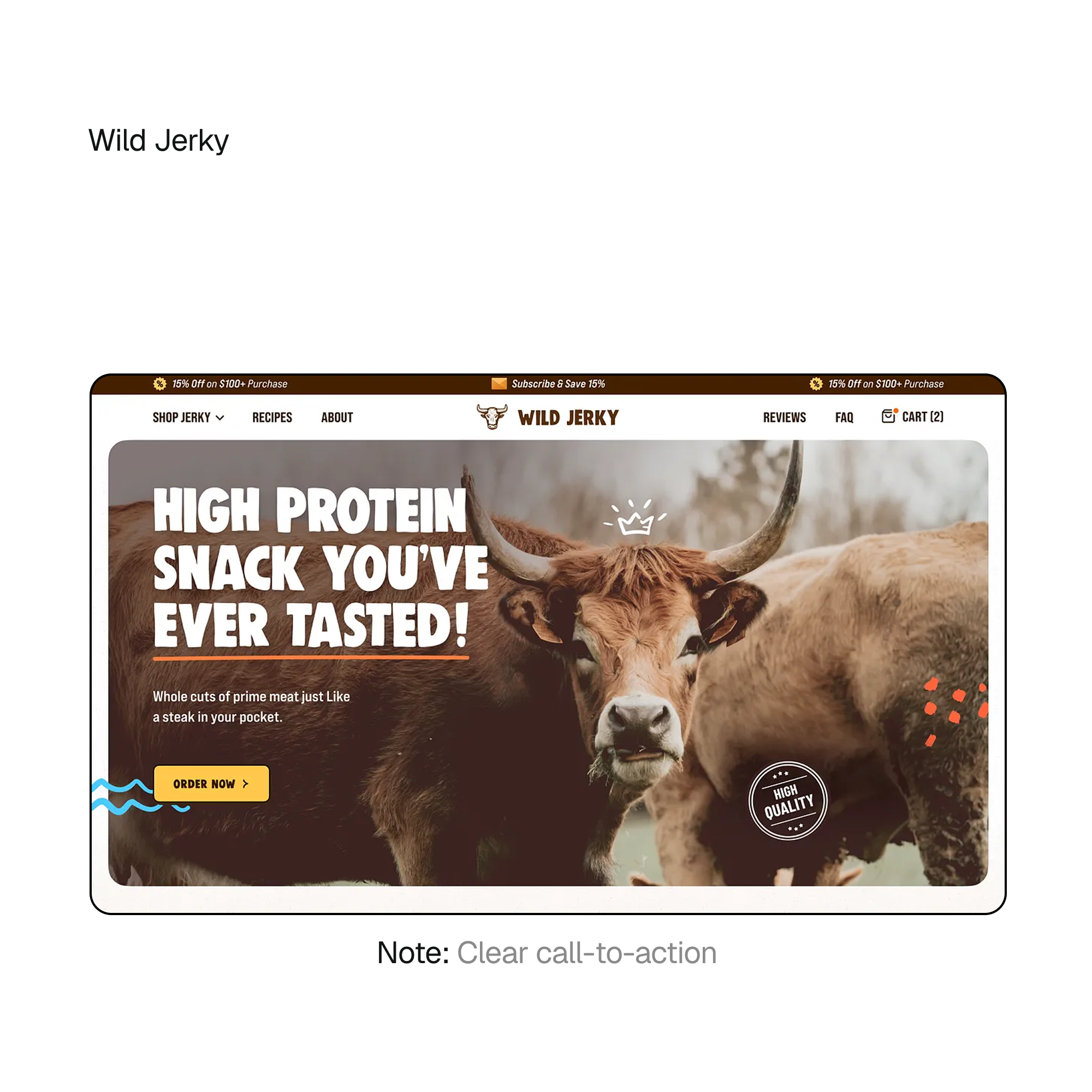
Wild Jerky
Iterations
Refining The Landing Page Through Iterative Design
Design Iteration & Concept Testing
I drafted multiple versions of the homepage cover, experimenting with layout, imagery, and content hierarchy while keeping the brand’s existing logo and typography intact. These iterations allowed us to compare approaches and align on a direction that felt both visually refined and authentic to Prookie’s identity.

Initial website cover: basic layout, minimal branding.

Bare-minimum placeholder: moved text to the left, added requested placeholder.
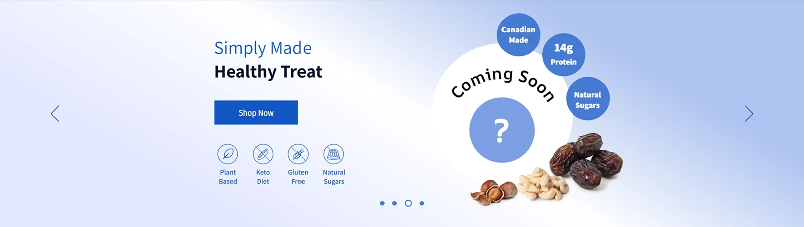
Draft 1: new structure, carousel and 4 highlights.
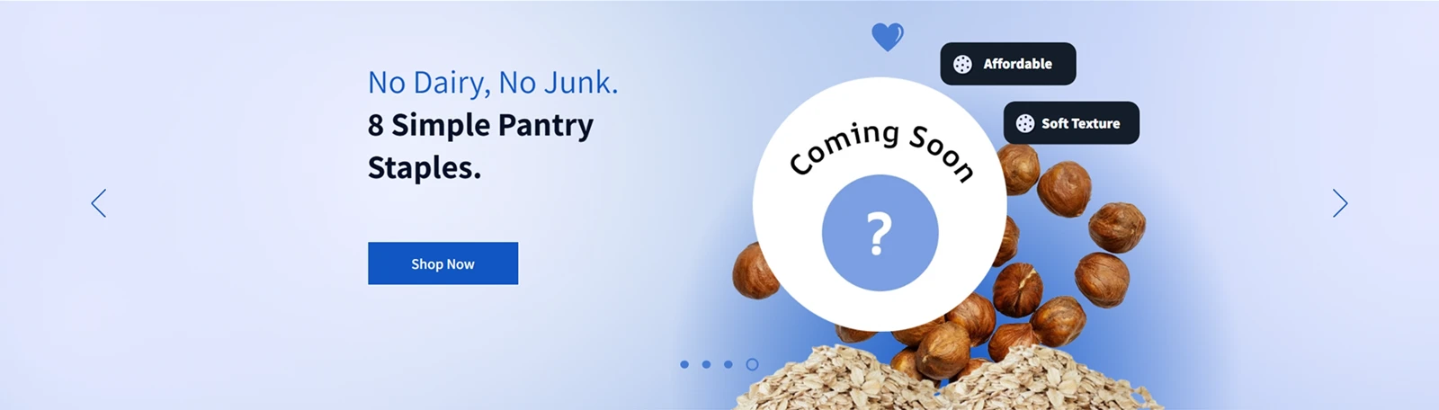
Draft 2: cookie-specific featured section (kept aside for future launch).
Draft 3: background experimentation.
Draft 4: Alternate cover arrangemeent.
Draft 5: ingredient spread experimentation.
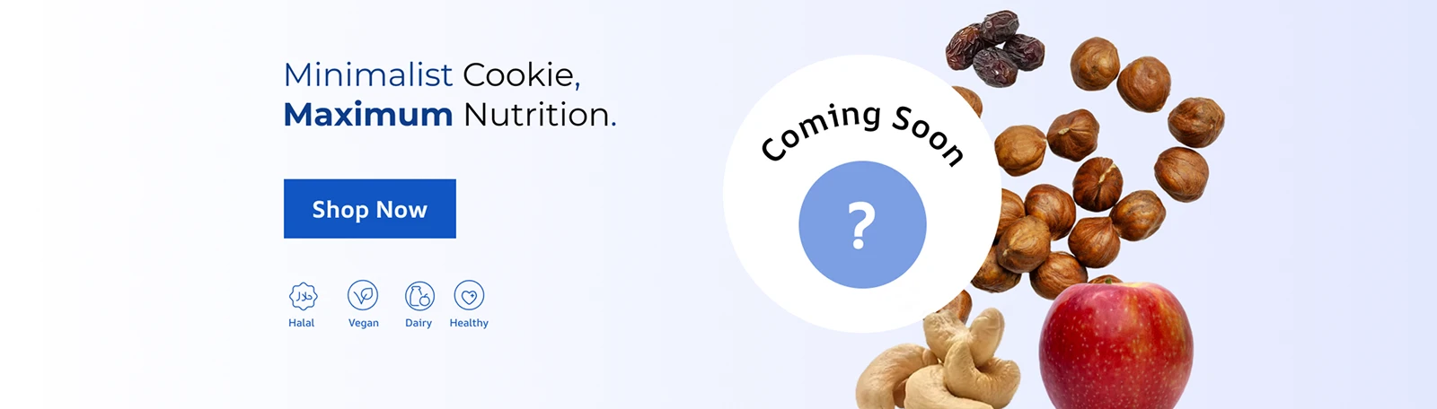
Final polish: selected design for balance and allignment.
Decision-Making
Designing With The CEO's Vision
Stakeholder Feedback & Design Alignment
After discussing the visual exploration, the CEO chose to retain Prookie’s original colour and typography as it was in line with the brand's identity. I used visual iterations to demonstrate how layout and imagery alone could elevate the experience. Through collaborative review, we selected a final direction that respected the brand’s identity while improving clarity, polish, and product focus.
.webp)
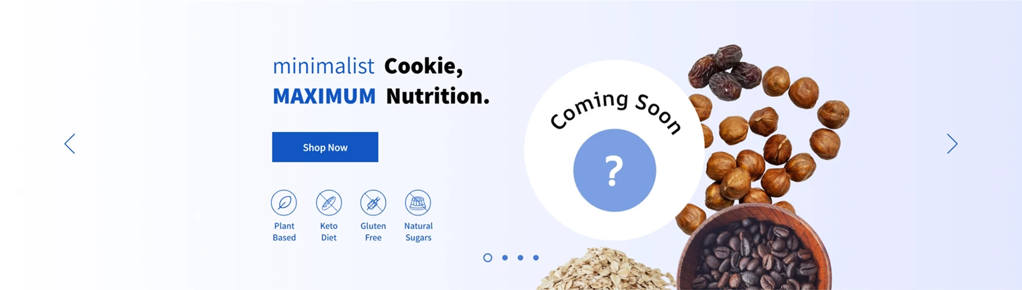
Final design and additional pages selected after collaborative review with the CEO.

Impact
Strengthening Prookie’s first impression.
A More Polished, Conversion-Ready Experience.
implemented directly in Wix
to refine hierarchy and visual clarity
aligned with founder vision and user needs
Reflection
Designing Within Constraints
Reflection
This project reinforced that effective UX design is often about working within constraints rather than pushing unnecessary change. Collaborating closely with a founder taught me how to advocate for user-centered improvements while respecting an existing brand vision. Designing directly in Wix sharpened my ability to make practical, high-impact decisions that improved clarity, trust, and product focus without overcomplicating the experience.